
Introducing regression#
These are some notes to introduce simple regression.
The example regression problem#
So far we have been looking at the relationship between a neural predictor and a voxel time course. We have thus far used correlation to look for a relationship.
To make things simpler, for illustration, lets look the relationship between two short example arrays. We will get back to the voxel and predictor problem later.
Let’s imagine that we have measured scores for a “psychopathy” personality trait in 12 students. We also have some other information about these students. For example, we measured how much sweat each student had on their palms, and we call this a “clammy” score. We first try and work out whether the “clammy” score predicts the “psychopathy” score. We’ll do this with simple linear regression.
Simple linear regression#
We first need to get our environment set up to run the code and plots we need.
# Import numerical and plotting libraries
import numpy as np
import numpy.linalg as npl
import matplotlib.pyplot as plt
# Only show 6 decimals when printing
np.set_printoptions(precision=6)
Here are our scores of “psychopathy” from the 12 students:
psychopathy = np.array([11.416, 4.514, 12.204, 14.835,
                        8.416,  6.563, 17.343, 13.02,
                        15.19, 11.902, 22.721, 22.324])
These are the skin-conductance scores to get a measure of clamminess for the handshakes of each student:
clammy = np.array([0.389,  0.2,    0.241,  0.463,
                   4.585,  1.097,  1.642,  4.972,
                   7.957,  5.585,  5.527,  6.964])
We have n values, where the value of n is:
n = len(clammy)
n
12
We happen to believe that there is some relationship between clammy
and psychopathy. Plotting them together we get:
plt.plot(clammy, psychopathy, '+')
plt.xlabel('Clamminess of handshake')
plt.ylabel('Psychopathy score')
Text(0, 0.5, 'Psychopathy score')
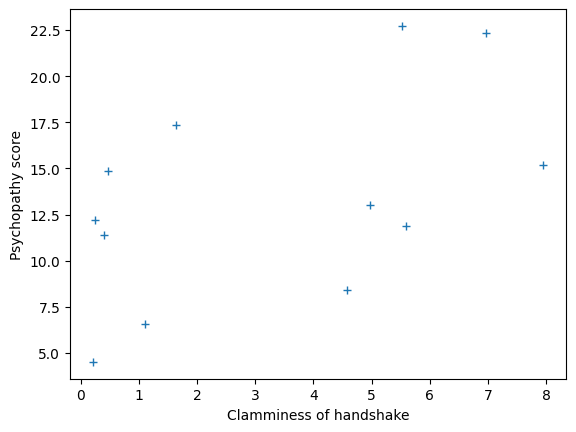
It looks like there may be some sort of straight line relationship. We can define any line by specifying the:
Intercept and the
Slope
The intercept is the y-axis value where the line crosses the y-axis. Put another way, it is the value for y when x==0.
Let’s give clammy the name x and psychopathy the name y, to match the terminology.
x = clammy
y = psychopathy
What does our straight line relationship mean?
We are saying that the values of y (psychopathy) can be partly predicted by
a straight line of formula 0.9 * x + 10 (remember, x is clammy).
The slope is change in the number of units in y, for every one unit change in x. We can check this anywhere on the line, but one easy way to get the slope is to subtract the y value at x == 0 from the y value at x == 1. This is, by definition, the number of units increase in y, for a one unit increase in x.
We could try guessing at a line to fit the data. Let’s try an intercept of \(10\) and slope \(0.9\).
The line gives a predicted y value for every x value, like this:
guessed_inter = 10
guessed_slope = 0.9
predicted_y = guessed_inter + guessed_slope * x
predicted_y
array([10.3501, 10.18  , 10.2169, 10.4167, 14.1265, 10.9873, 11.4778,
       14.4748, 17.1613, 15.0265, 14.9743, 16.2676])
# Plot the data
plt.plot(x, y, '+', label='Actual values')
# Plot the predicted values
plt.plot(x, predicted_y, 'ro', label='Values predicted from line')
plt.xlabel('Clamminess of handshake')
plt.ylabel('Psychopathy score')
plt.title('Clammy vs psychopathy with guessed values from line')
plt.legend()
<matplotlib.legend.Legend at 0x7f19a8766e00>
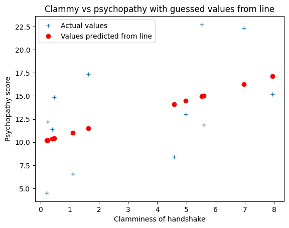
That’s the guess for the line, but is it a good guess?
How would we decide?
A good guess#
Our job is to look for a number to evaluate the line, compared to other lines. We want a number that is low when the line is good, and high when the line is bad.
If the line is good, then it makes good predictions. A good prediction is close to the value is it trying to predict.
In this case the line is trying to predict 12 y values.
For each point, we can draw the distance between the predicted y value and the actual y value, like this:
# Plot the data
plt.plot(x, y, '+', label='Actual values')
# Plot the predicted values
plt.plot(x, predicted_y, 'ro', label='Values predicted from line')
# Plot the distance between predicted and actual, for all points.
for i in range(n):
    plt.plot([x[i], x[i]], [predicted_y[i], y[i]], 'k:')
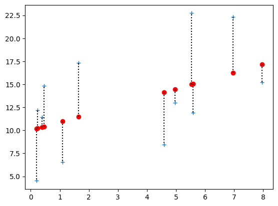
Here are all 12 differences between the actual and predicted values. We will call these the prediction errors:
errors = y - predicted_y
errors
array([ 1.0659, -5.666 ,  1.9871,  4.4183, -5.7105, -4.4243,  5.8652,
       -1.4548, -1.9713, -3.1245,  7.7467,  6.0564])
If the line was perfect, then all these errors would be zero. But, given these errors are not zero, how should we use them to give a single number to evaluate the line, where a low number means it is a good line.
A bad measure#
It might seem good to add up all the errors, like this:
sum(errors)
4.7882
That is not a good idea, because we are just as concerned about the negative and the positive errors. If we add them up, then big negative errors cancel big positive errors. The result is that I can make a line that is obviously crazy, and so should have a bad score, but in fact it has just the same score.
# A very bad line
rotten_inter = 10 + np.mean(x) * 1.8  # Don't worry about this calculation
rotten_slope = -0.9  # The opposite slope from our previous guess!
rotten_pred_y = rotten_inter + rotten_slope * x
rotten_pred_y
array([15.5932, 15.7633, 15.7264, 15.5266, 11.8168, 14.956 , 14.4655,
       11.4685,  8.782 , 10.9168, 10.969 ,  9.6757])
Notice that there are more big positive and big negative errors now:
rotten_errors = y - rotten_pred_y
rotten_errors
array([ -4.1772, -11.2493,  -3.5224,  -0.6916,  -3.4008,  -8.393 ,
         2.8775,   1.5515,   6.408 ,   0.9852,  11.752 ,  12.6483])
# Plot the data
plt.plot(x, y, '+', label='Actual values')
# Plot the predicted values
plt.plot(x, rotten_pred_y, 'ro', label='Values predicted from line')
# Plot the distance between predicted and actual, for all points.
for i in range(n):
    plt.plot([x[i], x[i]], [rotten_pred_y[i], y[i]], 'k:')
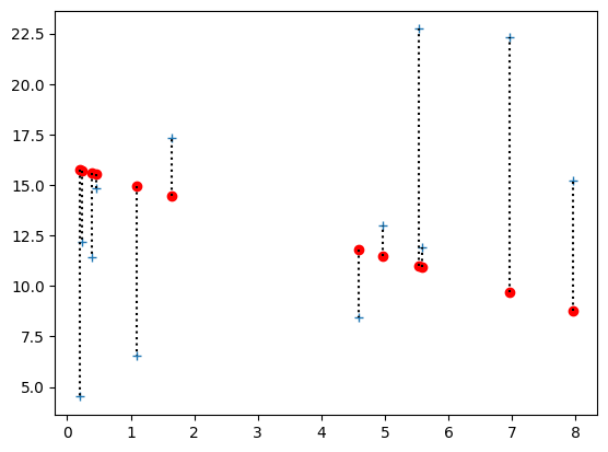
But the sum is nearly the same, because the positive and negative errors are canceling:
np.sum(rotten_errors)
4.788199999999996
So — what would be a better measure?
A better measure#
We care just as much about negative errors as positive, and we do not want to allow negative errors to cancel out with positive ones.
There are two obvious ways to fix that.
One is to throw away the negative signs of the errors before we add them. We use the np.abs function (abs for absolute) to throw away the negative signs, like this:
np.abs(errors)
array([1.0659, 5.666 , 1.9871, 4.4183, 5.7105, 4.4243, 5.8652, 1.4548,
       1.9713, 3.1245, 7.7467, 6.0564])
So, a better score would be the sum of the absolute error (SAE). Notice that, this time, the bad line gets a much larger (worse) score than the good line.
good_line_sae = np.sum(np.abs(errors))
print('Good line sum abs error', good_line_sae)
rotten_line_sae = np.sum(np.abs(rotten_errors))
print('Rotten line sum abs error', rotten_line_sae)
Good line sum abs error 49.491
Rotten line sum abs error 67.6568
Another option is to remove the negative signs by squaring all the errors. This will also have the effect of making big errors more influential in giving the score to the line. This is called the sum of squared error (SSE). Again, the bad line gets a bad (large) score:
good_line_sse = np.sum(errors ** 2)
print('Good line sum squared error', good_line_sse)
rotten_line_sse = np.sum(rotten_errors ** 2)
print('Rotten line sum squared error', rotten_line_sse)
Good line sum squared error 255.75076072
Rotten line sum squared error 589.6984907200001
We can also take the mean of the squared (or absolute) error, instead of the sum. In the squared case, this is the Mean Squared Error (MSE). This is just the sum value divided by the number of values.
good_line_mse = np.mean(errors ** 2)
print('Good line mean squared error', good_line_mse)
print('The same as SSE divided by n', good_line_sse / n)
Good line mean squared error 21.31256339333333
The same as SSE divided by n 21.31256339333333
The MSE can be easier to think about, because it is the average error per point.
good_line_mse = np.mean(errors ** 2)
print('Good line mean squared error', good_line_mse)
rotten_line_mse = np.mean(rotten_errors ** 2)
print('Rotten line mean squared error', rotten_line_mse)
Good line mean squared error 21.31256339333333
Rotten line mean squared error 49.14154089333334
In fact, we will prefer MSE (or, equivalently, SSE) to the sum or mean of the absolute error, because it has some nice mathematical properties, that we will not go into now.
Intercept? Slope? Intercept?#
We now have a problem, because we want to find the best (slope and intercept). By best we will say we mean the (slope, intercept) pair that gives the lowest MSE, of all possible (slope, intercept) pairs.
But — where to start? I can set the intercept, and try lots of slopes, and find the one that gives the lowest MSE, but then I need to try another intercept, and another.
One way of removing this problem is working on x and y values in the form of z-scores. When we do this, it turns out, for mathematical reasons we go into here, that the best (MSE) intercept is always 0. That simplifies our problem, because we can assume the intercept is 0, and just look at the slopes.
To z-scores#
As you remember from A reminder on correlation, we generate z-scores by subtracting the mean, and dividing by the standard deviation.
Let’s do that for our x and y:
x_z = (x - np.mean(x)) / np.std(x)
y_z = (y - np.mean(y)) / np.std(y)
While we are here, let’s calculate the correlation. We will all the correlation value r, because that’s the standard letter for the Pearson correlation that we are using here. In fact, it is often called “Pearson’s r” - see the Wikipedia page.
# Calculate the correlation
r = np.mean(x_z * y_z)
r
0.5178777312914015
# Or course this is (within tiny floating-point error) the same as:
np.corrcoef(x, y)[0, 1]
0.5178777312914012
When we plot these z-score versions, we see that an intercept of 0 looks about right:
plt.plot(x_z, y_z, '+')
plt.title('x, y in z-score form')
Text(0.5, 1.0, 'x, y in z-score form')
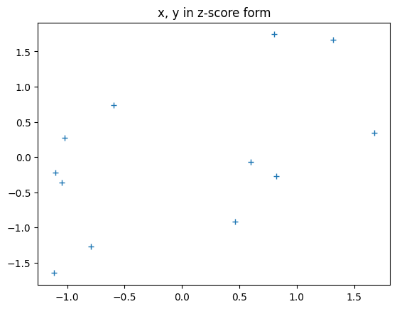
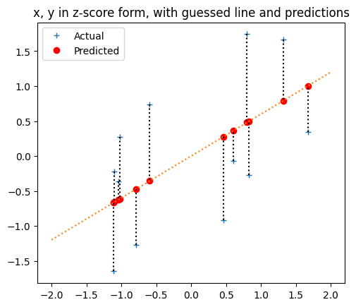
Let’s try a slope of about 0.6, and an intercept of 0.
pred_y_z = 0 + 0.6 * x_z
plt.plot(x_z, y_z, '+', label='Actual')
plt.plot(x_z, pred_y_z, 'ro', label='Predicted')
# Draw the predicting line
x_lims = np.array([-2, 2])
plt.plot(x_lims, 0 + x_lims * 0.6, ':')
# Draw the errors
for i in np.arange(len(x_z)):
    plt.plot([x_z[i], x_z[i]], [y_z[i], pred_y_z[i]], 'k:')
plt.title('x, y in z-score form, with guessed line and predictions')
# Make the axes scale x and y to equal lengths per unit.
plt.gca().set_aspect('equal')
# Put legend for points.
plt.legend()
<matplotlib.legend.Legend at 0x7f198073f9d0>
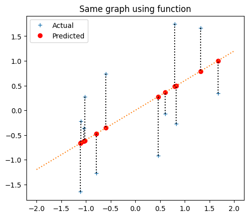
In fact, let’s make that into a function to do some plots later:
def plot_line_data(x, y, slope, inter, x_lims):
    pred_y = inter + slope * x
    plt.plot(x, y, '+', label='Actual')
    plt.plot(x, pred_y, 'ro', label='Predicted')
    # Draw the predicting line
    plt.plot(x_lims, inter + slope * np.array(x_lims), ':')
    # Draw the errors
    for i in np.arange(len(x)):
        plt.plot([x[i], x[i]], [y[i], pred_y[i]], 'k:')
    plt.gca().set_aspect('equal')
    return pred_y
plot_line_data(x_z, y_z, 0.6, 0, np.array([-2, 2]))
plt.title('Same graph using function')
plt.legend()
<matplotlib.legend.Legend at 0x7f19807b9db0>
The MSE is:
errors = y_z - pred_y_z
mse_for_guess = np.mean(errors ** 2)
mse_for_guess
0.7385467224503185
Our life will be easier with a function to calculate the MSE for a given slope and intercept.
def calc_mse(x, y, slope, inter):
    predicted = inter + slope * x
    errors = y - predicted
    return np.mean(errors ** 2)
calc_mse(x_z, y_z, 0.6, 0)
0.7385467224503185
We assumed that 0 was the best intercept in the sense of giving the smallest MSE, but is that true?
Let’s try lots of intercepts, with a given slope of 0.6, and see what MSE values we get.
# -1 to 1 in steps of 0.001
intercepts_to_try = np.arange(2000) / 1000 - 1
n_intercepts = len(intercepts_to_try)
# Corresponding MSE values
mses_for_intercepts = np.zeros(n_intercepts)
for i in np.arange(n_intercepts):
    inter = intercepts_to_try[i]
    mses_for_intercepts[i] = calc_mse(x_z, y_z, 0.6, inter)
mses_for_intercepts[:10]
array([1.738547, 1.736548, 1.734551, 1.732556, 1.730563, 1.728572,
       1.726583, 1.724596, 1.722611, 1.720628])
plt.plot(intercepts_to_try, mses_for_intercepts)
plt.xlabel('intercept')
plt.ylabel('MSE for intercept')
plt.title('MSE values for intercepts, slope=0.6')
Text(0.5, 1.0, 'MSE values for intercepts, slope=0.6')

This is the minimum (best) value we found for MSE, for all the intercepts we tried.
np.min(mses_for_intercepts)
0.7385467224503185
The np.argmin function tells us the index (position) of this minimum value.
min_index = np.argmin(mses_for_intercepts)
min_index
1000
By the definition of the np.argmin function, the value of mses_for_intercepts at this index, is the minimum.
mses_for_intercepts[min_index]
0.7385467224503185
Now we know the index of the minimum value, we can find the intercept value that corresponds to this MSE value:
intercepts_to_try[min_index]
0.0
Sure enough, as we asserted before, 0 was the intercept value giving the lowest (best) MSE, for all the intercepts we tried.
But - maybe that is only true for our particular slope: 0.6. We will try a different slope - say 0.2
# Corresponding MSE values
mses_for_intercepts_0p2 = np.zeros(n_intercepts)
for i in np.arange(n_intercepts):
    inter = intercepts_to_try[i]
    mses_for_intercepts_0p2[i] = calc_mse(x_z, y_z, 0.2, inter)
mses_for_intercepts[:10]
array([1.738547, 1.736548, 1.734551, 1.732556, 1.730563, 1.728572,
       1.726583, 1.724596, 1.722611, 1.720628])
plt.plot(intercepts_to_try, mses_for_intercepts_0p2)
plt.xlabel('intercept')
plt.ylabel('MSE for intercept')
plt.title('MSE values for intercepts, slope=0.2')
Text(0.5, 1.0, 'MSE values for intercepts, slope=0.2')
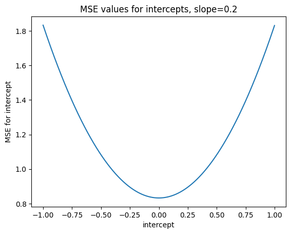
min_index_0p2 = np.argmin(mses_for_intercepts_0p2)
mses_for_intercepts_0p2[min_index_0p2]
0.8328489074834392
intercepts_to_try[min_index_0p2]
0.0
Our preliminary guess - that turns out to be right when we analyze this mathematically - is that 0 is always the best intercept for z-scored x and y, regardless of slope, and regardless of the x and y that we z-scored.
Now let’s find the best slope, assuming an intercept of 0.
# -1 to 1 in steps of 0.001
slopes_to_try = np.arange(2000) / 1000 - 1
n_slopes = len(slopes_to_try)
mses_for_slopes = np.zeros(n_slopes)
for i in np.arange(n_slopes):
    slope = slopes_to_try[i]
    mses_for_slopes[i] = calc_mse(x_z, y_z, slope, 0)
mses_for_slopes[:10]
array([3.035755, 3.032721, 3.029688, 3.026657, 3.023628, 3.020602,
       3.017577, 3.014554, 3.011533, 3.008515])
plt.plot(slopes_to_try, mses_for_slopes)
plt.xlabel('slope')
plt.ylabel('MSE for slope')
plt.title('MSE values for slopes, intercept=0')
Text(0.5, 1.0, 'MSE values for slopes, intercept=0')
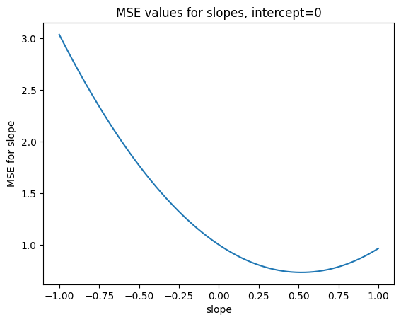
min_index_slope = np.argmin(mses_for_slopes)
print('Min MSE for slopes', mses_for_slopes[min_index_slope])
best_slope = slopes_to_try[min_index_slope]
print('Slope giving min MSE', best_slope)
Min MSE for slopes 0.7318026703821082
Slope giving min MSE 0.518
Wait - but best_slope is almost exactly the same as the correlation!. And in fact, it is not exactly the same only because we are not trying every value for slope, but only in steps 0.001 apart. With the r (correlation) value for slope, we get value for MSE that is even a tiny bit lower than the best value we found by searching.
calc_mse(x_z, y_z, r, 0)
0.731802655432471
We have discovered that the r value (correlation) is also the slope of the best-fit (MSE) line for the z-scored x and y values.
If you are interested to see why the best MSE error line must have slope \(r\) and intercept 0, have a look at the mathematics of the correlation line.
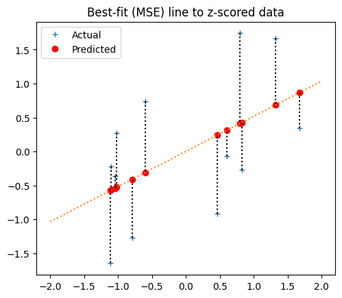
Here’s the best-fit line, using, using r:
plot_line_data(x_z, y_z, r, 0, np.array([-2, 2]))
plt.title('Best-fit (MSE) line to z-scored data')
plt.legend()
<matplotlib.legend.Legend at 0x7f19809efc70>
Best fit line for the original data#
We now have the best-fit line for the z-score data. What does this line look like for the original data, before the z-score transformation?
To answer this question, we gradually undo the z-score transformations, while keeping track on the effect on the best-bit line. First let’s multiply the y_z values by the standard deviation of the original ys to undo that part of the z-transformation. The result is the y values that just have the mean subtracted.
y_minus_mean = y_z * np.std(y)  # Undo division by standard deviation
plot_line_data(x_z, y_minus_mean, r * np.std(y), 0, np.array([-6, 6]))
plt.title('Best-fit (MSE) line to z-scored x, de-meaned y')
Text(0.5, 1.0, 'Best-fit (MSE) line to z-scored x, de-meaned y')
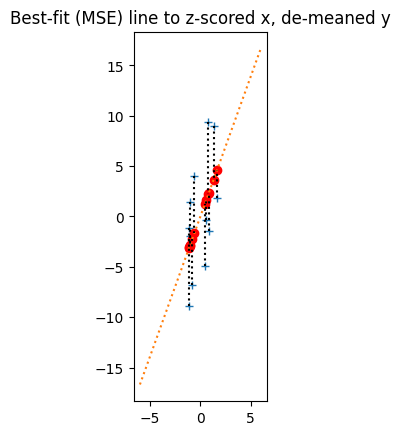
Notice that, when we do this, the y values all stretch on the y axis by a factor of np.std(y) How about slope of the best-fit line?
Remember, the slope is the number of units that y increases for a one-unit increase in x. Because the y values scale by a factor of np.std(y), the number of units of y for a one-unit increase in x also scales by a factor of np.std(y), and the equivalent best-fit line has slope r * np.std(y).
Next we undo the np.std(x) transformation the x_z values.
x_minus_mean = x_z * np.std(x)  # Undo division by standard deviation on x.
pred_y_minus_mean = plot_line_data(x_minus_mean, y_minus_mean, r * np.std(y) / np.std(x), 0, np.array([-5, 5]))
plt.title('Best-fit (MSE) line to de-meaned x and y')
Text(0.5, 1.0, 'Best-fit (MSE) line to de-meaned x and y')
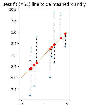
Now the x_z values stretch by a factor of np.std(x) along the x-axis. The previous y increase for one unit in x (the slope) becomes the y increase for a 1 * np.std(x) increase on x, so, to get the new slope, we divide the previous slope by np.std(x).
The last thing we need to do is undo the subtraction of np.mean(y) and np.mean(x). When we do this, we shift all the points np.mean(y) up on the y-axis, and np.mean(x) right on the x-axis, like this:
y_back_again = y_minus_mean + np.mean(y)  # Obviously also == y
x_back_again = x_minus_mean + np.mean(x)  # Obviously also == x
pred_y_back_again = pred_y_minus_mean + np.mean(y)
plt.plot(x_back_again, y_back_again, '+')
plt.plot(x_back_again, pred_y_back_again, 'ro')
# Set axis limits for comparison with plot below.
plt.axis([-1, 9.5, 3.5, 24])
plt.gca().set_aspect('equal')
plt.title('Original data, and transformed predictions');
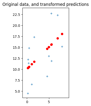
It might seem intuitive, and it is in fact correct, that when we shift the points on the graph like this, we can shift the line with them. That is, the line just moves with the points, as you can see from the updated predictions above. So, the slope does not change, and we already know the slope.
best_original_slope = r * np.std(y) / np.std(x)
best_original_slope
0.9992572262138827
Although the slope has not changed, the point that the line hits the y axis has - and that is the intercept.
To find the new intercept, we can track back from any point we know is on the new line. One convenient point is the shifted origin. Before we added back the means, the origin, at 0, 0, was on the line. After we add back the means, that point has moved to position np.mean(x), np.mean(y), so we know that point is on the line. To track back from that point along the line to the y-axis, we move -np.mean(x) units along the line. So, in terms of y, we start at np.mean(y) then move best_original_slope * -np.mean(y) units as we move along the x-axis. The new intercept is therefore:
best_original_intercept = np.mean(y) - best_original_slope * np.mean(x)
best_original_intercept
10.071285848579462
plot_line_data(x, y,
               best_original_slope, best_original_intercept,
               np.array([0, 9]))
plt.title('Best-fit (MSE) line to orinal data, reconstructed from r');
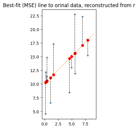
calc_mse(x, y, best_original_slope, best_original_intercept)
21.07713387082818
To confirm that is these are in fact the best (MSE) slope and intercept, we would have to calculate the MSE for all possible intercept and slope pairs, but here we just confirm that if we assume the intercept is correct, we have the best slope:
# Try slopes between 0 and 2 in steps of 1/1000
orig_slopes_to_try = np.arange(2000) / 1000
n_orig_slopes = len(orig_slopes_to_try)
mses_for_orig_slopes = np.zeros(n_orig_slopes)
for i in np.arange(n_orig_slopes):
    slope = orig_slopes_to_try[i]
    mses_for_orig_slopes[i] = calc_mse(x, y, slope, best_original_intercept)
mses_for_orig_slopes[:10]
array([39.687577, 39.650347, 39.613155, 39.575999, 39.538881, 39.501801,
       39.464757, 39.427751, 39.390782, 39.35385 ])
plt.plot(orig_slopes_to_try, mses_for_orig_slopes)
[<matplotlib.lines.Line2D at 0x7f198026ba90>]
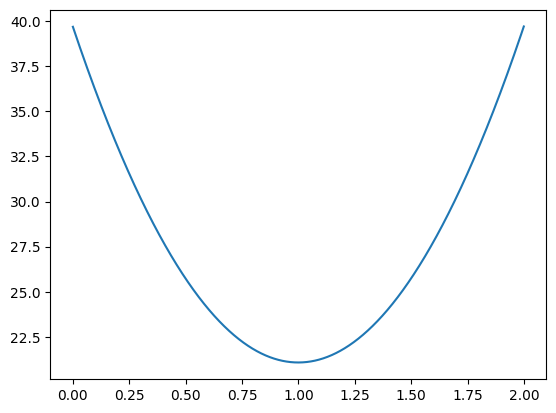
# The slope giving the lowest MSE in the search.
orig_slopes_to_try[np.argmin(mses_for_orig_slopes)]
0.999
And, if we assume the slope is correct, we have the best intercept:
# Try intercepts between 0 and 20 in steps of 1/1000
orig_inters_to_try = np.arange(20000) / 1000
n_orig_inters = len(orig_inters_to_try)
mses_for_orig_inters = np.zeros(n_orig_inters)
for i in np.arange(n_orig_inters):
    inter = orig_inters_to_try[i]
    mses_for_orig_inters[i] = calc_mse(x, y, best_original_slope, inter)
mses_for_orig_inters[:10]
array([122.507933, 122.487791, 122.467651, 122.447514, 122.427378,
       122.407245, 122.387113, 122.366984, 122.346856, 122.32673 ])
plt.plot(orig_inters_to_try, mses_for_orig_inters)
[<matplotlib.lines.Line2D at 0x7f19802959c0>]
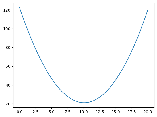
# The intercept giving the lowest MSE in the search.
orig_inters_to_try[np.argmin(mses_for_orig_inters)]
10.071
Question: How would you try a large number of slope, intercept pairs to see which is the best? Hint: You might consider using a 2D array somewhere.
Automating the best-slope calculation with Scipy#
We can ask Scipy to use a calculation that is based on the correlation calculation above, to get this best slope and intercept automatically:
import scipy.stats
results = scipy.stats.linregress(x, y)
results
LinregressResult(slope=0.9992572262138825, intercept=10.071285848579462, rvalue=0.5178777312914014, pvalue=0.0845895203804765, stderr=0.5219718130218388, intercept_stderr=2.2534509778472835)
Notice the slope, intercept and correlation values are (almost precisely) the same as we found using our correlation calculations above.