Arrays as images, images as arrays#
You can consider arrays as images, and images as arrays.
We start off with the imports that we need.
# The standard library for working with arrays.
import numpy as np
# Standard library for plotting.
import matplotlib.pyplot as plt
Let’s make an array of numbers between 0 through 99:
an_array = np.array([[ 0,  0,  0,  0,  0,  0,  0,  0],
                     [ 0,  0,  0,  9, 99, 99, 94,  0],
                     [ 0,  0,  0, 25, 99, 99, 79,  0],
                     [ 0,  0,  0,  0,  0,  0,  0,  0],
                     [ 0,  0,  0, 56, 99, 99, 49,  0],
                     [ 0,  0,  0, 73, 99, 99, 31,  0],
                     [ 0,  0,  0, 91, 99, 99, 13,  0],
                     [ 0,  0,  9, 99, 99, 94,  0,  0],
                     [ 0,  0, 27, 99, 99, 77,  0,  0],
                     [ 0,  0, 45, 99, 99, 59,  0,  0],
                     [ 0,  0, 63, 99, 99, 42,  0,  0],
                     [ 0,  0, 80, 99, 99, 24,  0,  0],
                     [ 0,  1, 96, 99, 99,  6,  0,  0],
                     [ 0, 16, 99, 99, 88,  0,  0,  0],
                     [ 0,  0,  0,  0,  0,  0,  0,  0]])
an_array.shape
(15, 8)
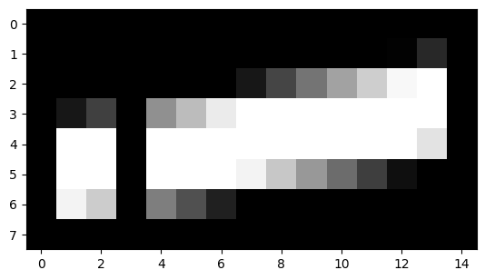
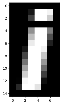
In fact this array represents a monochrome picture of a letter.
We can show arrays as images using the plt.imshow command from
matplotlib. Here is the default output:
plt.imshow(an_array)
<matplotlib.image.AxesImage at 0x7f9cbd7216f0>
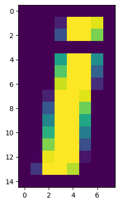
The image is weirdly colorful. That is because matplotlib is using the default
colormap. A colormap is a mapping from values in the array to colors. The default Matplotlib colormap is called viridis and maps low numbers
in the image (0 in our case) to purple, and high numbers (99 in our case) to
yellow.
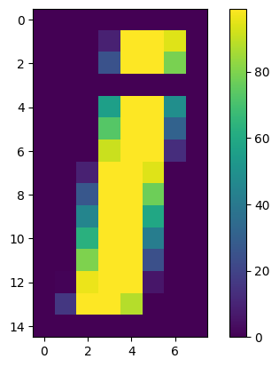
We can see the relationship of the numbers to the colors by asking matplotlib to show the colormap:
plt.imshow(an_array)
plt.colorbar()
<matplotlib.colorbar.Colorbar at 0x7f9cbd66fd90>
In our case, our image would make more sense as grayscale, so we use the
gray colormap, like this:
plt.imshow(an_array, cmap='gray')
plt.colorbar()
<matplotlib.colorbar.Colorbar at 0x7f9cbd547b50>
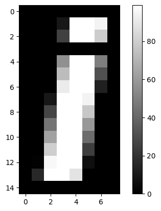
A grayscale image is an array containing numbers giving the pixel intensity values - in our case between 0 and 99.
Here we set gray to the default colormap for the rest of our plots:
# Set 'gray' as the default colormap
plt.rcParams['image.cmap'] = 'gray'
This setting means that, by default, Matplotlib will use the gray colormap for the rest of this session.
# The default colormap is now gray.
plt.imshow(an_array)
plt.colorbar()
<matplotlib.colorbar.Colorbar at 0x7f9cbd4038b0>
Matplotlib does not save this change, so we would have to rerun this command for each session we want to change the default. There are ways of making Matplotlib remember default changes, but we won’t go into those here.
We can also plot lines in matplotlib. For example, here are the values from the row at position 8 in this array. Because Python indices start at 0, this is the 9th row of the array.
# Row position 8, all the columns.
an_array[8, :]
array([ 0, 0, 27, 99, 99, 77, 0, 0])
Actually, we can omit the second :, Numpy will assume we mean all the columns, if we just specify the row:
# Also, row position 8, all the columns.
an_array[8]
array([ 0, 0, 27, 99, 99, 77, 0, 0])
We might want to plot the values in row 8. To do this, we use the plt.plot function. The first argument to this function is the x values for the plot, and the second argument is the y values. We will use the column positions as for the x values:
col_positions = np.arange(8)
col_positions
array([0, 1, 2, 3, 4, 5, 6, 7])
# Specifying x and y values.
plt.plot(col_positions, an_array[8])
[<matplotlib.lines.Line2D at 0x7f9cbd4f82e0>]
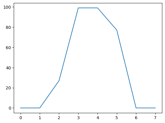
The x axis is the column position in the array (0 through 7) and the y axis is the value of the array row at that position.
In fact, we can even omit the x values in this case, and Matplotlib will assume we mean the x values to be np.arange(8), where 8 is the length of the y values array.
# Just specifying the y values, we get the x values default.
plt.plot(an_array[8])
[<matplotlib.lines.Line2D at 0x7f9cbd356e00>]
The plot shows us the 0 values at the edges of the bar of the “i”, and the ramp up to the peak at the middle of the bar of the “i”, in columns number 3 and 4.
A transpose in numpy uses the .T method on the array. This has the effect
of flipping the rows and columns (in 2D):
an_array.T
array([[ 0,  0,  0,  0,  0,  0,  0,  0,  0,  0,  0,  0,  0,  0,  0],
       [ 0,  0,  0,  0,  0,  0,  0,  0,  0,  0,  0,  0,  1, 16,  0],
       [ 0,  0,  0,  0,  0,  0,  0,  9, 27, 45, 63, 80, 96, 99,  0],
       [ 0,  9, 25,  0, 56, 73, 91, 99, 99, 99, 99, 99, 99, 99,  0],
       [ 0, 99, 99,  0, 99, 99, 99, 99, 99, 99, 99, 99, 99, 88,  0],
       [ 0, 99, 99,  0, 99, 99, 99, 94, 77, 59, 42, 24,  6,  0,  0],
       [ 0, 94, 79,  0, 49, 31, 13,  0,  0,  0,  0,  0,  0,  0,  0],
       [ 0,  0,  0,  0,  0,  0,  0,  0,  0,  0,  0,  0,  0,  0,  0]])
# Defaults to gray colormap
plt.imshow(an_array.T)
<matplotlib.image.AxesImage at 0x7f9cbd3abe20>
We can also reshape the original array to a 1D array, by stacking all the rows end to end.
Here’s the original array:
an_array
array([[ 0,  0,  0,  0,  0,  0,  0,  0],
       [ 0,  0,  0,  9, 99, 99, 94,  0],
       [ 0,  0,  0, 25, 99, 99, 79,  0],
       [ 0,  0,  0,  0,  0,  0,  0,  0],
       [ 0,  0,  0, 56, 99, 99, 49,  0],
       [ 0,  0,  0, 73, 99, 99, 31,  0],
       [ 0,  0,  0, 91, 99, 99, 13,  0],
       [ 0,  0,  9, 99, 99, 94,  0,  0],
       [ 0,  0, 27, 99, 99, 77,  0,  0],
       [ 0,  0, 45, 99, 99, 59,  0,  0],
       [ 0,  0, 63, 99, 99, 42,  0,  0],
       [ 0,  0, 80, 99, 99, 24,  0,  0],
       [ 0,  1, 96, 99, 99,  6,  0,  0],
       [ 0, 16, 99, 99, 88,  0,  0,  0],
       [ 0,  0,  0,  0,  0,  0,  0,  0]])
Here is the array, reshaped to 1D
a_1d_array = np.reshape(an_array, 15 * 8)
a_1d_array
array([ 0,  0,  0,  0,  0,  0,  0,  0,  0,  0,  0,  9, 99, 99, 94,  0,  0,
        0,  0, 25, 99, 99, 79,  0,  0,  0,  0,  0,  0,  0,  0,  0,  0,  0,
        0, 56, 99, 99, 49,  0,  0,  0,  0, 73, 99, 99, 31,  0,  0,  0,  0,
       91, 99, 99, 13,  0,  0,  0,  9, 99, 99, 94,  0,  0,  0,  0, 27, 99,
       99, 77,  0,  0,  0,  0, 45, 99, 99, 59,  0,  0,  0,  0, 63, 99, 99,
       42,  0,  0,  0,  0, 80, 99, 99, 24,  0,  0,  0,  1, 96, 99, 99,  6,
        0,  0,  0, 16, 99, 99, 88,  0,  0,  0,  0,  0,  0,  0,  0,  0,  0,
        0])
a_1d_array.shape
(120,)
Reshaping the array to one dimension is a common operation, so there is a
separate Numpy command for that, np.ravel:
np.ravel(an_array)
array([ 0,  0,  0,  0,  0,  0,  0,  0,  0,  0,  0,  9, 99, 99, 94,  0,  0,
        0,  0, 25, 99, 99, 79,  0,  0,  0,  0,  0,  0,  0,  0,  0,  0,  0,
        0, 56, 99, 99, 49,  0,  0,  0,  0, 73, 99, 99, 31,  0,  0,  0,  0,
       91, 99, 99, 13,  0,  0,  0,  9, 99, 99, 94,  0,  0,  0,  0, 27, 99,
       99, 77,  0,  0,  0,  0, 45, 99, 99, 59,  0,  0,  0,  0, 63, 99, 99,
       42,  0,  0,  0,  0, 80, 99, 99, 24,  0,  0,  0,  1, 96, 99, 99,  6,
        0,  0,  0, 16, 99, 99, 88,  0,  0,  0,  0,  0,  0,  0,  0,  0,  0,
        0])
One use of the 1D version of the array, is for making a histogram of the distribution of values in the array:
plt.hist(a_1d_array)
(array([75.,  2.,  3.,  1.,  3.,  2.,  1.,  3.,  2., 28.]),
 array([ 0. ,  9.9, 19.8, 29.7, 39.6, 49.5, 59.4, 69.3, 79.2, 89.1, 99. ]),
 <BarContainer object of 10 artists>)
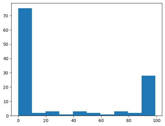
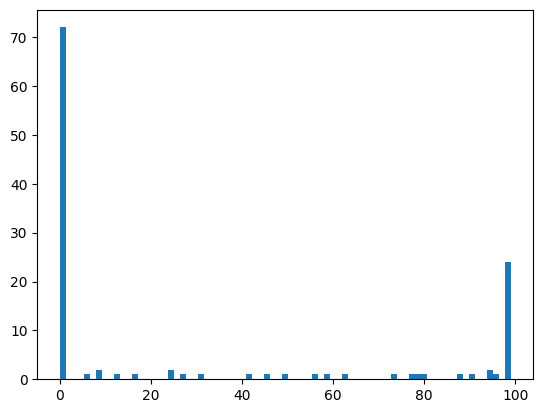
By default, the plt.hist function uses 50 bins, but you can specify how
many bins you want with the bins keyword:
plt.hist(a_1d_array, bins=75)
(array([72.,  0.,  0.,  0.,  1.,  0.,  2.,  0.,  0.,  1.,  0.,  0.,  1.,
         0.,  0.,  0.,  0.,  0.,  2.,  0.,  1.,  0.,  0.,  1.,  0.,  0.,
         0.,  0.,  0.,  0.,  0.,  1.,  0.,  0.,  1.,  0.,  0.,  1.,  0.,
         0.,  0.,  0.,  1.,  0.,  1.,  0.,  0.,  1.,  0.,  0.,  0.,  0.,
         0.,  0.,  0.,  1.,  0.,  0.,  1.,  1.,  1.,  0.,  0.,  0.,  0.,
         0.,  1.,  0.,  1.,  0.,  0.,  2.,  1.,  0., 24.]),
 array([ 0.  ,  1.32,  2.64,  3.96,  5.28,  6.6 ,  7.92,  9.24, 10.56,
        11.88, 13.2 , 14.52, 15.84, 17.16, 18.48, 19.8 , 21.12, 22.44,
        23.76, 25.08, 26.4 , 27.72, 29.04, 30.36, 31.68, 33.  , 34.32,
        35.64, 36.96, 38.28, 39.6 , 40.92, 42.24, 43.56, 44.88, 46.2 ,
        47.52, 48.84, 50.16, 51.48, 52.8 , 54.12, 55.44, 56.76, 58.08,
        59.4 , 60.72, 62.04, 63.36, 64.68, 66.  , 67.32, 68.64, 69.96,
        71.28, 72.6 , 73.92, 75.24, 76.56, 77.88, 79.2 , 80.52, 81.84,
        83.16, 84.48, 85.8 , 87.12, 88.44, 89.76, 91.08, 92.4 , 93.72,
        95.04, 96.36, 97.68, 99.  ]),
 <BarContainer object of 75 artists>)
As you can imagine, it’s not hard to go back to the 2D shape, by splitting the 1D array back into 15 rows of 8 values each (and therefore 8 columns):
array_back = np.reshape(a_1d_array, (15, 8))
array_back
plt.imshow(array_back)
<matplotlib.image.AxesImage at 0x7f9cbd2b17e0>
In numpy, basic operations like multiplication, addition, comparison, are always elementwise. For example, this multiplies every array value by 10:
an_array * 10
array([[  0,   0,   0,   0,   0,   0,   0,   0],
       [  0,   0,   0,  90, 990, 990, 940,   0],
       [  0,   0,   0, 250, 990, 990, 790,   0],
       [  0,   0,   0,   0,   0,   0,   0,   0],
       [  0,   0,   0, 560, 990, 990, 490,   0],
       [  0,   0,   0, 730, 990, 990, 310,   0],
       [  0,   0,   0, 910, 990, 990, 130,   0],
       [  0,   0,  90, 990, 990, 940,   0,   0],
       [  0,   0, 270, 990, 990, 770,   0,   0],
       [  0,   0, 450, 990, 990, 590,   0,   0],
       [  0,   0, 630, 990, 990, 420,   0,   0],
       [  0,   0, 800, 990, 990, 240,   0,   0],
       [  0,  10, 960, 990, 990,  60,   0,   0],
       [  0, 160, 990, 990, 880,   0,   0,   0],
       [  0,   0,   0,   0,   0,   0,   0,   0]])
Comparison is also elementwise. For example, this gives True for every value > 50, and False for every value <= 50:
an_array > 50
array([[False, False, False, False, False, False, False, False],
       [False, False, False, False,  True,  True,  True, False],
       [False, False, False, False,  True,  True,  True, False],
       [False, False, False, False, False, False, False, False],
       [False, False, False,  True,  True,  True, False, False],
       [False, False, False,  True,  True,  True, False, False],
       [False, False, False,  True,  True,  True, False, False],
       [False, False, False,  True,  True,  True, False, False],
       [False, False, False,  True,  True,  True, False, False],
       [False, False, False,  True,  True,  True, False, False],
       [False, False,  True,  True,  True, False, False, False],
       [False, False,  True,  True,  True, False, False, False],
       [False, False,  True,  True,  True, False, False, False],
       [False, False,  True,  True,  True, False, False, False],
       [False, False, False, False, False, False, False, False]])
Matplotlib will treat False as 0 and True as 1, so this is one way of binarizing the image at a threshold (of 50 in this case):
plt.imshow(an_array > 50)
<matplotlib.image.AxesImage at 0x7f9cbd02e020>
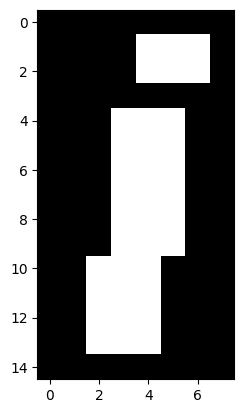
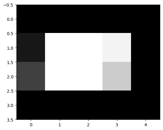
We can slice arrays as we slice strings or lists. The difference for arrays is that we can slice in any or all dimensions at the same time. For example, to get the dot of the “i” it looks (from the numbers at the sides of the ploat) that we want to the top 4 rows, and the last 5 columns:
an_array[0:4, 3:]
plt.imshow(an_array[0:4, 3:])
<matplotlib.image.AxesImage at 0x7f9cbd0a3310>